Q-Labyrinth Bookstore

Q-Labyrinth Bookstore: Navigating Wonder, One Page at a Time
Challenge
The Q-Labyrinth Bookstore is a concept-driven retail space and cultural sanctuary, designed to embody the quiet magic of literary discovery. Set in a mysterious, organic environment rich in dark greens and hidden corners, the bookstore offers a curated selection of high-quality books and stationeries. It aims to become not just a place of purchase, but a destination of introspection, inspiration, and slow living.
How to visually represent a space that is both structured like a labyrinth and fluid like thought? The challenge was to craft a brand identity that honors the dual nature of Q-Labyrinth: rooted in intellectual quality and abundance (Q = Quality, Quantity, Quickness), while evoking a sense of timeless mystery and immersive calm.
Goal
To create a brand world that reflects the essence of a ‘literary labyrinth’ — elegant, organic, slightly arcane yet inviting. The identity needed to seamlessly bridge intellectual credibility with emotional allure, drawing in both casual readers and devoted bibliophiles.
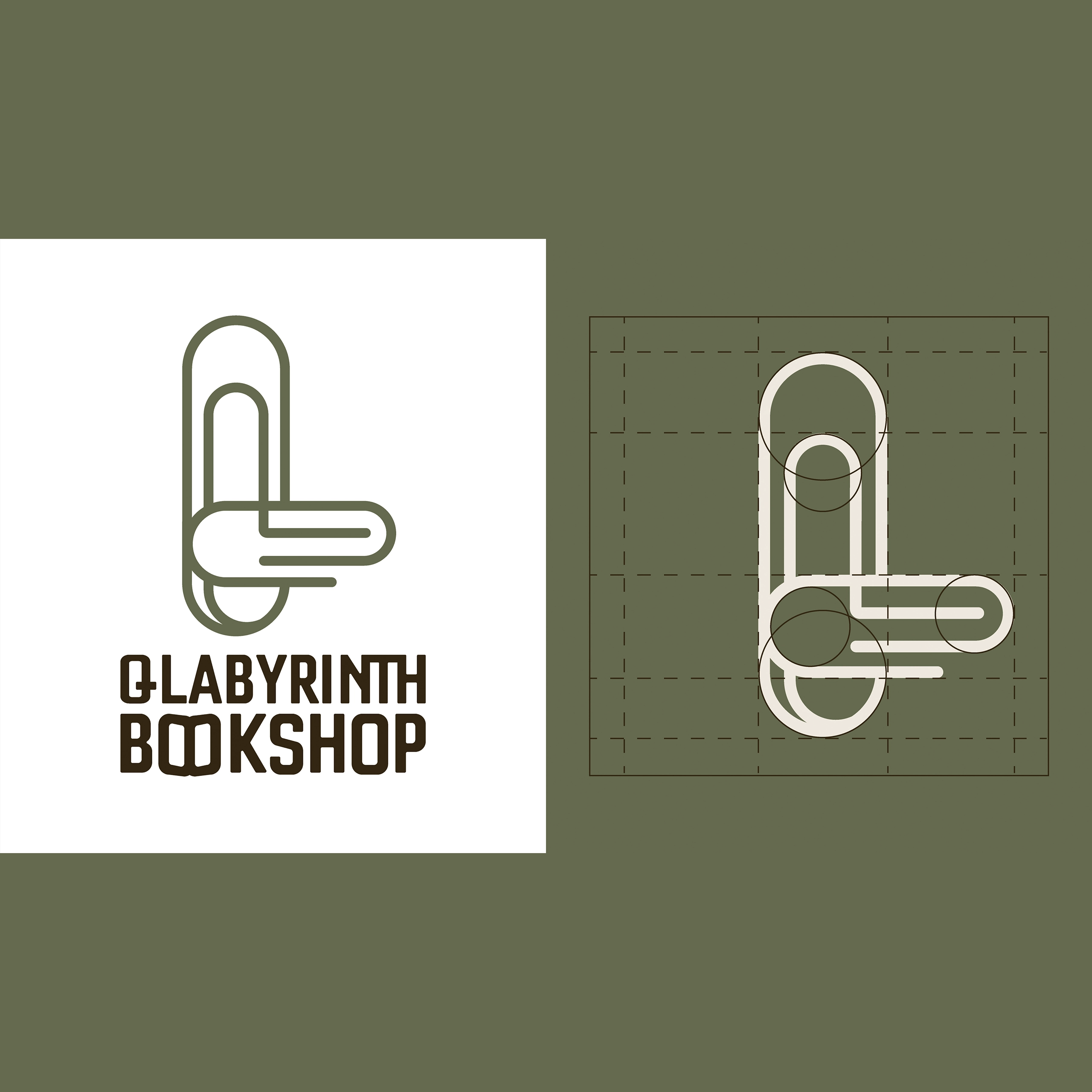
Solution
We developed a branding system inspired by vintage apothecaries, secret gardens, and antique libraries. The color palette is grounded in lush, dark greens and aged neutrals, evoking both nature and the patina of time. The logomark incorporates maze-like forms with a modern serif “Q” at its core. Typography blends classic serif readability with subtle modern twists. Textures and layout flow in a way that mimics the winding journey of the store’s physical space, allowing visitors to feel lost — in the best way.
Brand Identity